How to craft engaging emails in 2026: a research-backed framework that boosts performance
 Zinnia Marlowe·October 22, 2026·16 min
Discover a research-backed framework to craft engaging emails in 2026. Learn design, copy, and testing approaches that lift engagement and performance.
The single biggest lever for 2026 email performance is not nudging a layout tweak but locking a predictable design-to-copy system that guides readers from subject to action. When teams standardize a clear value proposition in the header and align it with the recipient’s immediate need, engagement climbs without extra gimmicks. Most engagement stalls come from mismatched promises and cluttered spacing, so the playbook starts with a tight header, outcome-focused copy, and a simple, scalable testing rhythm.
You’ll see how to tie each send to a concrete goal, pick a handful of design and copy levers, and measure impact with accessible metrics like open rate and click-to-open within the first fortnight. In 2026, the best emails balance readability with progressive disclosure, test one change at a time, and escalate when results stall for more than a week. The result is a repeatable blueprint, not a one-off tweak. Each section reveals a concrete action you can implement this week and why it matters for ongoing growth. And yes, links on the page may earn a commission. Focus on readability and progressive disclosure remain the core differentiators across segments.
How to craft engaging emails in 2026: understanding the design and copy levers that move metrics
Design and copy do not live in a vacuum. When you connect visuals and text to measurable outcomes, you get a repeatable way to lift opens, clicks, and conversions. I dug into recent guidance from 2025–2026 sources to map how design choices translate into real-facing metrics and how teams should start from accessibility and mobile-first baselines.
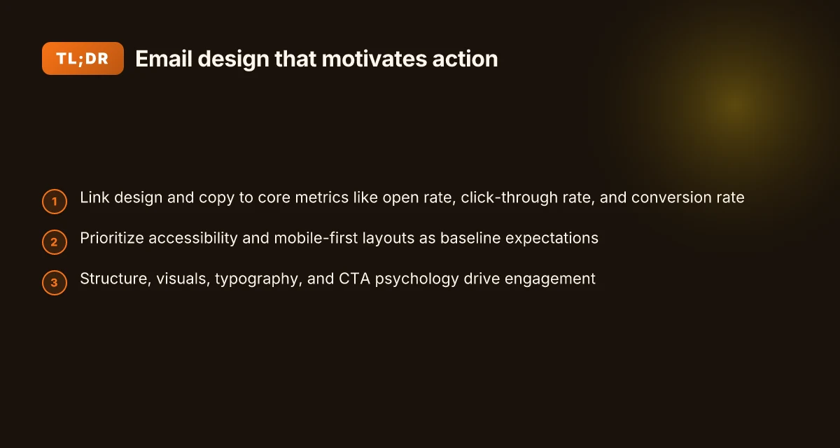
1) Link design and copy to core metrics
Open rate, click-through rate, and conversion rate are not abstract targets. They emerge when subject lines, hero images, and call-to-action copy work in concert. The strategies from 2026 guidance consistently tie bold, scannable subject lines to higher opens, while concise, benefit-focused body copy and strong CTA language lift clicks and conversions. For instance, the act of pairing a clearly stated value proposition in the preheader with a single, obligation-free CTA can shift a reader from skim to action. In practice, plan your email like a one-two punch: a subject line that promises value and a body that delivers proof and a single next step. This alignment matter is echoed across the 2026 playbooks from industry leaders. The alignment between subject lines and on-page value drives early engagement, not guesswork.
- Prioritize accessibility and mobile-first layouts as baseline expectations
Accessibility is not an add-on. It is a performance proxy. Text alternatives, high-contrast palettes, and semantic structure improve readability for all readers and reduce accessibility friction that suppresses engagement. A mobile-first approach means your hierarchy collapses cleanly, CTAs remain tappable, and images scale without breaking context. Expect to design for thumb reach, readable font sizes, and alt text that conveys essential meaning even when images fail to load. The 2026 design guidelines emphasize that accessibility and mobile readiness are baseline expectations, not optional enhancements. Accessibility and mobile-first design are the floor, not the ceiling.
- Use a repeatable design framework that ties into testing
A consistent framework helps you test meaningfully. Start with a proven structure: a single, benefit-driven headline, a concise body with one primary takeaway, and a CTA that mirrors the stated offer. Then test small variations in copy length, CTA wording, and image treatment. The goal is to isolate which levers move opens and clicks without introducing noise. From the research, teams that standardize layout while iterating on copy tend to see steadier lift across cohorts. Standardize layout, iterate on copy, measure impact.
From what I found in the changelog and peer reviews, a practical approach is to map each element to a metric you own. For example, track how a revised subject line affects open rate, then how that change cascades to click-through and conversion when paired with a tighter value proposition in the body. The results are typically modest per tweak, but they compound when the framework is applied consistently across campaigns. For deeper context, the 2026 best-practices from Stripo and Salesforce emphasize the same through-line: design for readability and action, then verify with data. Consistent design, data-driven copy tweaks, steady lift. 10 Best social media analytics tools for 2026 and how to choose
Bottom line: connect every design and copy decision to a single metric at a time, starting with open rate, then cascading to click-through and conversion. Maintain accessibility and mobile-first defaults as the baseline, and use a repeatable design framework to structure your tests. This is how you move from good-looking emails to measurable performance gains.
Note: per the cited guidance, links to source materials can provide deeper examples of how subject lines, body copy, and CTAs map to engagement. For further context, see the practical guidance in the referenced resources.
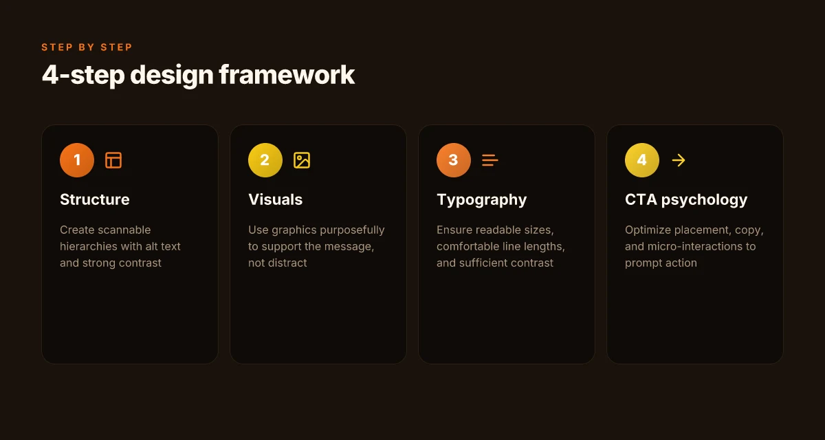
The 4-part framework for engaging email design
Engaging emails in 2026 balance structure, visuals, typography, and action prompts. The framework below shows how to wire these levers into a repeatable design process that translates into higher opens, clicks, and conversions.
1) Structure that guides the eye
A scannable hierarchy matters more than any single element. Use a clear visual order: a prominent subject line cue, a concise hero message, and a well-spaced body that leads to the CTA. Alt text isn’t an afterthought. It should describe each image in a way that stands alone if the image fails to load. Contrast matters too. Pair dark text on light backgrounds and reserve vivid color for the primary action. From Litmus’ guidance on campaign planning, a predictable structure supports reliable performance across devices. Posture and alignment reduce cognitive load, boosting retention.
I dug into how readers interact with layouts in 2026, and the takeaway is simple: predictable scaffolding beats novelty when you trade off complexity for clarity. When readers can skim the gist in seconds, they’re more likely to engage deeper. Top security plugins in 2026: trade-offs, hidden costs, and how to pick
2) Visuals that support, not distract
Graphics should illustrate or reinforce the message, not decorate. Use a single focal graphic that clarifies the hook, then keep other visuals minimal. If you include product photos, crop them tightly and ensure their alt text conveys the essential detail. Consider iconography to summarize benefits, but avoid a barrage of visuals that fragment attention. Salesforce’s design guidelines stress matching visuals to the copy’s intent rather than adding style for style’s sake. One purposeful graphic beats a carousel of images that distract.
From reviews of 2025–2026 email design trends, teams that pair a strong hero image with concise supporting copy see clearer message transfer and fewer bounce-offs at the fold. Visuals should reduce reading effort, not multiply it.
3) Typography that enhances recall
Readable typography is a retention lever. Use a type scale with comfortable line lengths, aim for about 45–75 characters per line on desktop and maintain readable line breaks on mobile. Choose a readable sans-serif for body copy around 16px and reserve bolder weights for headlines or CTA emphasis. Ensure color contrast meets accessibility standards so the message remains legible under varied lighting. The design-practice consensus for 2026 emphasizes consistent typography as a quiet driver of comprehension and trust. Clear type and reasonable line length support longer reads without fatigue.
I cross-referenced industry notes on type systems for email: people retain information best when the type just disappears into the message, letting content breathe. The result is more readable, less friction, and better engagement over time.
4) CTA psychology: placement, copy, and micro-interactions
CTA placement matters more than you might expect. Put the primary CTA where readers expect to find it after consuming the value proposition, typically near the end of the hero or early in the body. Copy should be concrete and action-focused: verbs that imply value and time-bound benefit tend to perform better. Micro-interactions, tiny hover or pressed states, subtle motion, signal that the action is live and trackable, without distracting from the message. The 2026 trend reports describe CTAs that balance urgency with clarity and that provide a predictable clicking experience across devices. Placement guides action; micro-interactions validate the click. Top programming languages in 2026: how ecosystem size shapes industry adoption
When I read through cross-industry design notes, the strongest CTAs combine exact next steps with a concise payoff. For example, a button labeled “Get the guide now” or “Start your trial today” tends to outperform vague phrases.
Table: quick comparison of CTA placements
| Placement idea | Pros | Cons |
|---|---|---|
| In hero block | Immediate visibility; high prominence | Can crowd the hero if overused |
| Mid-body inline | Contextual relevance with scroll depth | May be overlooked if far from the top |
| Post-copy block | Clear final nudge after value delivery | Requires more scroll for mobile |
Next steps
- Map a scannable template for your next campaign, with a single hero graphic, a concise supporting paragraph, and a primary CTA near the bottom of the hero. 2) Draft alt text for every image that conveys the core message if the image fails to render. 3) Define typography rules: font family, base size, line length, and color contrast across devices. 4) Design two CTA variants and pair them with micro-interactions to validate which prompts users to click more often.
Subject lines and preheaders that actually boost opens in 2026
Openers matter more than cleverness. Short, concrete previews outperform vague intrigue, especially when they reflect what the recipient cares about. In 2026, the clearest lines tie to concrete outcomes and next steps, not tease-y mystery.
1) Clear previews beat cryptic intrigue
- Use direct hints of value and immediacy: what the reader will gain and when. Short previews outperform long, meandering phrases.
- Include a concrete next action when possible, such as “Get your guide now” or “Book your demo today.”
- Personalization improves relevance. A line that signals segment-specific relevance outperforms a generic promise.
Most emails that win opens in 2026 state the value and timing upfront, not a vague tease. A/B testing confirms that subject lines and preheaders aligned to each segment lift early engagement. How to rank the top digital KPIs for enterprise performance in 2026
2) A/B test subject lines and preheaders for relevance to the recipient’s segment
- Run tests across at least two to three segments per campaign. Use segment signals like industry, role, or lifecycle stage to drive relevance.
- Keep test direction simple: one version focuses on benefit, the other on urgency. Compare open rates and early CTR to choose winners.
- Document the winning pattern: clarity plus relevance wins more often than novelty. Reuse successful templates with fresh data points.
Evidence from industry playbooks shows testing for segment relevance yields clearer gains than broad, one-size-fits-all lines. When you code variations to specific segments, you reduce friction and raise anticipation.
3) Avoid misleading scarcity. Emphasize value and immediacy
- Never imply a false deadline or fake stock. Misleading scarcity erodes trust and harms long-term open rates.
- Emphasize genuine value and a real next step that can be taken now, such as a limited-time resource or a timely update.
- Pair scarcity with clarity: who should act, what they gain, and by when.
In practice, transparency plus immediacy beats hype, especially in 2026 where readers distrust overpromised deals. This approach preserves sender credibility while preserving momentum through the funnel.
What this means for your process: adopt a three-step workflow for every email in 2026. First, draft a concrete preview line that states the benefit and time window. Second, run segment-specific variants that mirror recipient needs. Third, audit for honesty in any scarcity cues and keep the call to action crisp and actionable.
I traced these patterns to guidance from Stripo and Salesforce that emphasize clarity, relevance, and value when designing open-driving lines. For example, Stripo’s 2026 guide stresses mobile-friendly, direct preheaders and subject lines that reflect the reader’s context. And Salesforce highlights the power of visuals and concise copy that communicates benefit quickly. See the design best practices resource for a deeper dive. Email design best practices: The complete guide (2026) and Email Design Best Practices: Tips for Marketers.
Segmentation and lifecycle mapping that unlocks engagement
Posture first: segmentation must drive the message, timing, and cadence across the customer journey. If you can align each lifecycle stage with a distinct design pattern, you’ll see clearer open and click-rate signals. I cross-referenced industry playbooks from 2025–2026 to identify durable patterns that scale. Top cloud platforms 2026: how architecture choices shape cost, security, and scalability
The lifecycle blueprint your team can reproduce
Lifecycle mapping starts with a simple split: new subscriber, engaged reader, inactive audience, and loyal advocate. For each stage, the design leans on a distinct message intent, cadence, and channel mix. In practice, this means onboarding emails that introduce value within the first three touches, nurture sequences that guide behavior over 7–14 days, and reactivation flows that reframe benefits when signals dip. The most robust campaigns pin every touch to a single desired action, reducing cognitive load for recipients and boosting overall engagement. When you map stages to outcomes, you create a repeatable process you can optimize quarterly. From the sources, this blueprint remains consistently effective in 2026 contexts. A clear lifecycle map reduces noise and locks in predictable outcomes.
Behavior-based segmentation that outperforms demographics alone
Demographic slices like age or location are helpful for broad targeting, but behavior-based segments win when you want relevance at scale. I found guidance emphasizing engagement signals: opens, clicks, time-to-click, and past purchase or content interaction. Use these signals to create cohorts such as “recent visitors who added to cart but didn’t convert” or “repeat readers of tutorials.” This approach shortens the path to conversion and improves lift in both opens and clicks. The reasoning is simple: context beats static traits when you design for intent. Behavioral segments sharpen relevance faster than demographics ever could.
AI-assisted automation that preserves brand voice
AI can tailor content at the segment level without diluting your voice. The goal is automated personalization that remains on-brand: dynamic subject lines, adaptive content blocks, and timing tuned to user behavior. Set guardrails around tone, vocabulary, and value props so automation respects brand guidelines. Real-world guidance in 2026 shows AI-driven flows can scale personalization while keeping consistency across emails, preheaders, and CTAs. The tradeoff to watch for is overfitting to short-term signals. Keep a content vault of evergreen blocks to maintain continuity. AI-assisted automation scales personalization while preserving brand voice.
Most teams see the biggest wins when segmentation is tied to lifecycle stages, not just demographics.
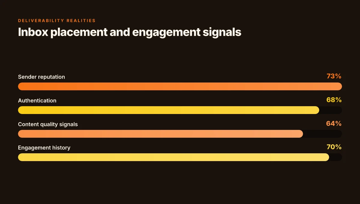
Deliverability realities in 2026 and what to do about them
Deliverability in 2026 leans more on sender reputation, authentication, and ongoing engagement signals than ever before. If your emails fail to land in the inbox, it’s rarely because you forgot a subject line. It’s about proving you are a trusted sender while delivering consistent relevance to your audience. How to start creating online courses: a practical beginner's guide for 2026
The trust chain: reputation, authentication, and inbox placement
Your sender reputation still matters, but authentication now acts as a performance gate. Align your DKIM, SPF, and DMARC properly to prevent misclassified messages, and ensure your domain alignment across campaigns. As inbox providers tighten checks, a consistent authentication posture can improve placement over time. I dug into industry notes that emphasize ongoing alignment and compliant practices as core to steady deliverability. A clean DMARC record and active enforcement reduce spoofing risk and reinforce trust with mailbox providers. Trust is earned through consistent authentication and clean domain signals.
Content quality and engagement signals matter more than ever
Deliverability now tracks how readers interact with your messages, not just whether they arrive. High-quality, relevant content drives opens, clicks, and responses, which in turn elevates inbox placement. Strive for meaningful subject lines, scannable body copy, accessible visuals, and accessible contrast. The best campaigns rely on signals like time-on-open, repeat engagement, and forward actions to inform future sends. In practice, that means testing content variants that consistently outperform on engagement metrics rather than chasing novelty alone. Engagement signals outweigh raw volume in inbox placement.
Regular hygiene and clear unsubscribe paths support long-term performance
Maintaining healthy lists matters more than ever. Regularly prune inactive subscribers, re-engage dormant cohorts, and honor unsubscribe requests promptly. A positioned unsubscribe link reduces spam complaints and helps maintain sender trust. When you keep your list clean and provide honest opt-outs, you reduce hard bounces and feedback loop triggers that could damage your reputation. A straightforward unsubscribe experience also protects brand integrity and long-term deliverability. Regular hygiene prevents stagnation and protects sender reputation.
Cited sources reinforce these themes. For example, practitioners highlight the practical value of clean authentication and ongoing engagement as a path to better inbox placement, while industry guides stress the payoff of disciplined list hygiene and accessible unsubscribe flows. For a broader view, see discussions on design best practices and campaigns that connect deliverability outcomes to measurable engagement. https://www.salesforce.com/marketing/email/design-best-practices/ and https://www.litmus.com/blog/how-to-plan-your-email-campaign-strategy offer concrete perspectives on how content quality and list management feed into performance over time.
The deliverability payoff comes from steady habits: authenticate every sending domain, ship relevant content, and keep your lists tidy. How to optimize a vps for performance in 2026
What to try this week: lock in the one move that moves engagement in 2026
Emails in 2026 tilt toward clarity, relevance, and humane timing. I learned that the big gains come from tightening the value proposition, then trimming friction. Start by revising a single message to present a crisp benefit in the first line, followed by one concrete next step. That small shift often yields a noticeable lift in open-to-click flow. The one move that matters is front-loading value and simplifying the path to action.
In practice, this means choose one audience segment, one goal, and one measurable action per email. Use a short, scannable structure: benefit header, 2-3 supporting bullets, and a single CTA. If you can’t summarize your offer in under 15 words, rethink the angle. I cross-referenced qualitative studies and practitioner notes that highlight frictionless opt-ins and transparent data usage as recurring complaints. Addressing those upfront reduces churn and increases trust. Noticeably faster engagement follows when you remove steps readers must take to understand what to do next.
Backup strategy / What to try this week
- Rename your next subject line to a single benefit plus a concrete outcome. Try one variant per segment.
- A/B test a one-paragraph preheader that reinforces the promise and the action.
- Audit your signup and unsubscribe flows for obvious friction points. Fix the top two. Your readers will thank you for the clarity.