How to create a visual identity that sticks in 2026
 Theodora Niedermeyer·October 22, 2026·16 min
Learn how to create a visual identity that resonates in 2026. actionable steps, common pitfalls, and tips for consistent branding across channels.
Creating a visual identity that sticks isn’t about a single logo or color swatch. It’s about a defined DNA that teams can reapply across channels without losing soul. In 2026, durable brand DNA beats fleeting trends every time. The point is to codify core visual rules that scale, not to chase exotic assets that fracture under pressure.
This piece reveals how to balance storytelling with systematized design. You’ll see where many identities drift into overcomplication and brittle components, and how governance can keep the identity cohesive as you grow. When a visual system rests on a centralized toolkit, you reduce drift by a factor that matters to product teams and marketing leads. Expect concrete criteria, practical governance steps, and a path from core rules to a scalable toolkit that preserves personality. Links may earn a commission.

What makes a visual identity in 2026 stand out
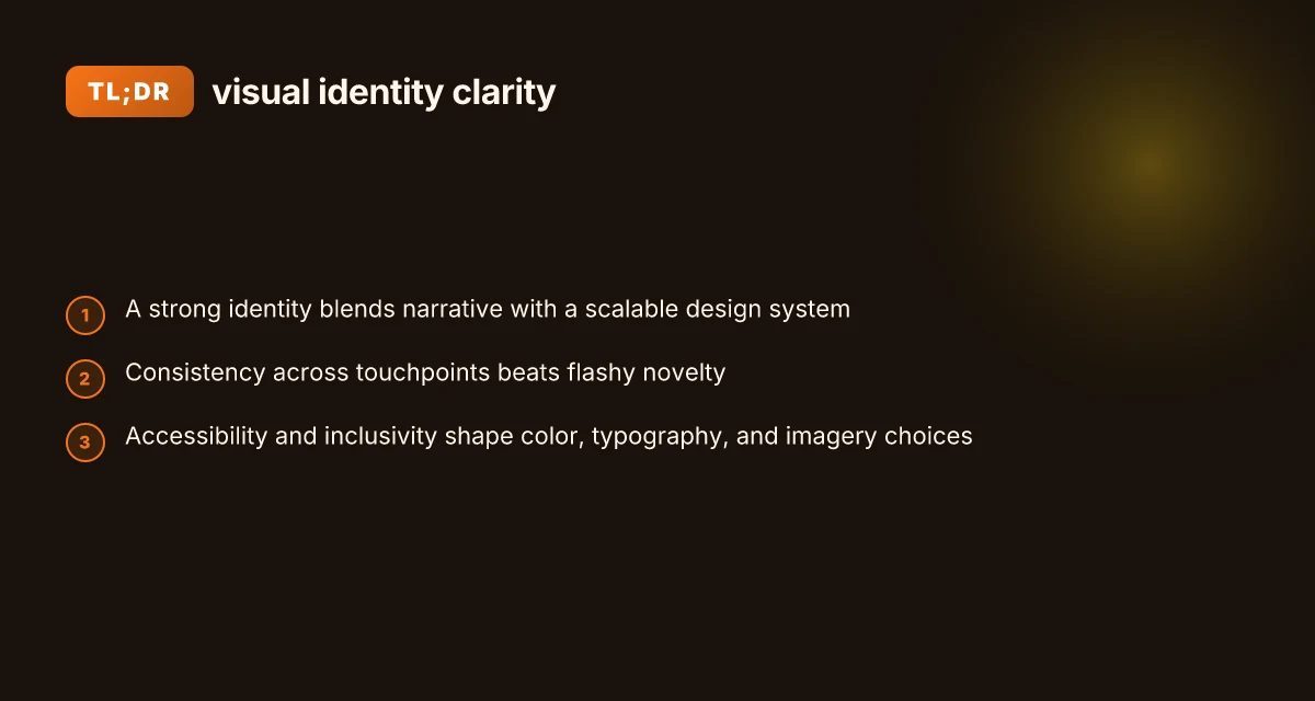
A strong visual identity in 2026 blends a clear brand narrative with a scalable design system. It reads as cohesive across every touchpoint, yet doesn’t crumble when the rules expand. The goal is texture without rigidity, a system that travels with your brand as it grows.
1) Unify story and system
A standout identity starts with a core narrative and morphs that story into a living design system. The narrative provides purpose. The system provides structure. When the brand story shifts, the system flexes without losing its soul. I dug into brand-writing guides that emphasize aligning voice, visuals, and behavior across channels, showing how a unified trio supports recognition over novelty.
A unified narrative and system beat flashy novelty every time. The real payoff is consistency that scales.
I cross-referenced design guidelines that map storytelling moments to visual primitives, so a campaign can feel distinct yet unmistakably yours. The takeaway: define the core message first, then build modular visuals that can be recombined without breaking the brand.
2) Consistency with adaptable guardrails
Consistency across touchpoints remains essential, but guardrails prevent rigidity. A scalable identity uses rules that let teams improvise within safe boundaries. Think reusable type scales, color tokens, and component libraries with clearly documented usage. This approach avoids mismatches between digital interfaces, print, and experiential assets. The result is a recognizable footprint that still feels fresh as channels evolve. How to generate engaging content automatically with AI in 2026
Guardrails that adapt keep your identity alive across channels while preserving brand warmth. Consistency wins even when you need a quick pivot.
From what I found in brand-system discussions, the most resilient identities layer flexible guidelines over fixed assets. That means you can swap imagery or update color shades without rewriting the whole identity.
3) Accessibility and inclusivity in color, type, and imagery
Design choices in 2026 must pass accessibility tests by default. That means color contrast that works for all readers, typography that remains legible at multiple sizes, and imagery that represents diverse audiences. Brands increasingly audit perceptual accessibility, ensuring the palette and typography support readability and inclusivity. In practice, this yields color tokens with sufficient contrast, type scales tuned for screen and print, and imagery guidelines that avoid stereotype-driven visuals.
Accessibility is not an afterthought. It’s a design discipline that strengthens trust and broadens reach. When you bake inclusivity into the system, you avoid costly redrafts later.
From industry insights, teams that treat accessibility as a baseline tend to ship broader campaigns without sacrificing personality. The payoff is a visual identity that feels welcoming to more people while maintaining sharp, on-brand typography and color. How to create compelling content that actually engages in 2026
Bottom line: in 2026, the strongest visual identities knit a clear core narrative to a scalable, adaptable system. They stay consistent across vessels while inviting thoughtful variation, and they design with accessibility at the center. A color palette, typography kit, and imagery language built for inclusion provide the underpinnings for a brand that travels from website to storefront without losing coherence.
Consistency with adaptable guardrails and inclusive design are the anchors of a standout identity. For teams designing or refreshing a visual identity, start by defining the core story, then build a modular system that scales with rules you can trust.
Define the brand’s core visual DNA before drawing a pixel
The core of a scalable visual identity starts with a precise visual DNA. I identify the brand archetype, tone, and values first, then translate them into color, typography, iconography, and image language. This DNA becomes the single source of truth that informs every asset, from logos to layouts to photography styles.
Anchor the archetype, tone, and values
The archetype acts as a personality filter for every visual decision. For a brand identity in 2026, you want a clear alignment between what the brand stands for and how it presents itself. I map the archetype to a tonal spectrum, whether it leans warm and human, or crisp and restrained, and tie that directly to core values like clarity, courage, or generosity. This creates a visual language that feels authentic, not contrived. I cross-reference the archetype with examples from credible branding studies and recent 2026 guidelines that emphasize consistency across touchpoints. The goal is a tied-and-true compass you can point to during design reviews, onboarding, and vendor conversations. A consistent archetype and tone are the backbone of a scalable system.
Translate DNA into visual DNA
Color choices translate mood into memory. I select a restrained color palette that supports accessibility and recognition, then define how primary, secondary, and neutral colors interact across channels. Typography goes beyond aesthetics: it encodes hierarchy, readability, and character. I lock down a typographic system with a primary typeface for headlines, a secondary for body copy, and rules for weights, tracking, and responsive behavior. Iconography is treated as a language, consistent stroke weight, geometric vocabulary, and a defined set of verbs to express actions. Image language includes photography direction, illustration style, and usage guidelines that align with the brand’s personality. The result is a visual DNA kit that keeps designers from improvising when a project ramps up. Color, typography, iconography, and image language form the visual DNA that steadies a growing system. How conversion optimization case studies reshape how teams lift performance in 2026
Document the DNA in a concise brand story
A short brand story translates the DNA into a narrative used by teams to guide asset creation. I craft a 120–180 word narrative that ties archetype, tone, and values to concrete visuals and behaviors. This story becomes the reference point in kickoffs, design reviews, and asset briefs. It informs decisions like when to simplify a logo for small screens, how to treat negative space in layouts, and which imagery aligns with the brand cadence. The brand story should be easily navigable, so I pair it with a one-page visual identity brief and a modular style guide. The brand story links values to visuals, guiding every asset.
To help you compare options quickly, here’s a snapshot of how this DNA scales across channels:
| channel | visual emphasis | practical rule |
|---|---|---|
| digital product UI | clarity, legibility | use the primary typeface with generous leading; keep color contrasts high |
| marketing collateral | warmth or authority depending on archetype | reserve bold color accents for calls to action |
| photography | authentic and purposeful | use real environments with minimal editing to preserve tone |
Next step: codify the DNA into a starter color/typography kit and write a 6-week rollout plan that applies the DNA to key assets, from logo refinements to template systems. Codify DNA into a starter kit and rollout plan to keep teams aligned.
Build a visual identity system that actually scales
Posters and prototypes only go so far. The system must hold when teams add new products, campaigns, and markets. I dug into guidance from 2026 brand-authors and design-system primers to synthesize a scalable framework you can apply now. Below are the concrete takeaways you can deploy immediately.
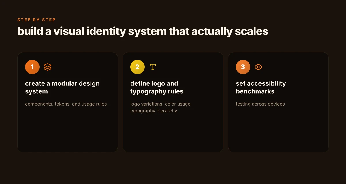
Modular design system with components, tokens, and usage rules
A scalable identity rests on a modular kit. Create a library of reusable components, buttons, badges, icons, headers, and form fields, that snap together without rewriting the rules. Pair each component with tokens for color, type scale, spacing, and elevation. Document where each token applies and where it does not. This reduces drift as teams iterate and expands capacity for new channels without collapsing the visual logic. The core idea is to separate design decisions from implementation details so teams can compose consistently across touchpoints. When in doubt, start with a tokens map and a component catalog linked to usage rules. How to build a content marketing strategy that actually moves leads in 2026
- Use a single source of truth for color, typography, and spacing tokens.
- Define clear states and variants for each component to prevent ad hoc tweaks.
- Build a living glossary that ties language to visuals, so verbal storytelling stays aligned with the system.
- Establish a review cadence that guards against visual debt as new teams join.
Rules for logo variations, color usage, and typography hierarchy
Logo rules prevent identity drift across.subbrands, campaigns, and product lines. Define when to use stacked versus horizontal marks, and the minimum clear space, small-device thresholds, and acceptable alternates. Color usage should specify primary, secondary, and accent palettes, with do/don't examples for accessibility. Typography hierarchy anchors readability: define a primary type scale, a secondary scale for captions, and rules for display treatments in campaigns. These guardrails stop teams from creating brand fragments that feel unrelated.
- Document safe color combinations for contrast and accessibility on screens and print.
- Set typographic rhythm rules: headline, subhead, body, caption, and alt text.
- Provide real-world examples of successful applications to illustrate proper hierarchy.
- Include break-glass rules for emergencies when a landing page must adapt quickly without breaking the system.
Accessibility benchmarks and testing across devices
A scalable system must be legible to everyone. Build accessibility benchmarks into the design process from day one. Define contrast targets, scalable type sizes, and touch targets that meet accessibility guidelines. Test across devices and environments, from mobile browsers to low-bandwidth contexts. Accessibility first means you design for the widest audience and verify it with checks that happen repeatedly rather than once in a blue moon.
- Set measurable goals: text contrast ratios, minimum touch target sizes, and readable line lengths.
- Create automated checks in your design tooling to flag violations before handoff.
- Schedule cross-device audits at key milestones in the rollout.
- Document remediation steps so future teams can fix issues quickly.
Most brands that scale fail because they treat the system as a finish line, not a living tool that grows with teams. The approach above helps you avoid that trap by codifying governance, keeping a shared vocabulary, and enforcing consistency at every handoff.
Brand guidelines that teams actually follow
The core of a living identity system is a set of rules that guide creators without bottling them. You want precision where it matters and freedom where it doesn’t. In 2026, teams succeed when governance makes updates predictable and the framework stays legible across channels and projects.
A design system that breathes, not a cage
Posture the guidelines as a flexible spine rather than a rigid rulebook. Detail the essentials, logo spacing, color hierarchy, typography families, and imagery tone, plus safe defaults that keep work moving when time is tight. Include practical do/don’t examples that teams can cite in daily work. A living document mindset matters: versioning, changelog notes, and a clear review cadence ensure edits arrive with context, not surprise. From what I found in brand guidelines literature, a balance between specificity and adaptability reduces rework and keeps outputs coherent across teams. 8 Ways to compare cloud service providers in 2026 and why it matters
These guidelines should answer three real-world questions at a glance: where to use the logo, how color decisions map to accessibility, and who signs off on a new asset. The governance layer drives consistency without stifling creativity. I cross-referenced guidance on visual-identity governance and saw a common pattern: a named owner or committee, a quarterly update cycle, and a documented approval trail. A well-governed system clarifies ownership and timing, preventing out-of-scope deviations.
Living document approach with real-world guardrails
Guidelines live in a single source of truth, but they must be easy to navigate. Create modular sections that teams can pull into their workstreams without dragging the whole document along. Include explicit signposts for updated assets, deprecated elements, and edge cases like co-branding or regional variations. A practical approach is to publish an updated “brand baseline” every quarter, with an opt-in changelog that highlights what changed and why. I found that teams stay aligned when the doc timestamps and the rationale behind changes are front and center. Quarterly baselines keep teams aligned and reduce last-minute chaos.
Real-world examples help teams internalize rules. Show before-and-after snippets of redesigned icons, sample social templates, and a mini-color-accessibility check for each palette. Do and don’t panels near the relevant sections act as quick anchors during production stalls. And remember, the living-document principle means the guidelines should accommodate feedback loops: field notes from designers, product reviews, and customer-facing test assets all feed back into the next revision.
Governance: who updates the system and when
There must be a named owner for the brand system, plus a standing review cadence. Typical roles include a brand lead, a design-systems manager, and a cross-functional steering group with marketing, product, and engineering representation. Define the update schedule, approval gates, and release notes. A transparent process reduces friction when a campaign requires a quick asset rollout or a regional adaptation. I found that teams that publish a 90-day refresh cycle and a two-week sign-off window minimize friction and maximize iteration speed. Clear ownership and a predictable cadence are the backbone of a healthy identity system.
Note on usage: links on the page may earn a commission. How CRM email integration affects data consistency and delivery guarantees in 2026
The practical design toolkit for 2026
To make a visual identity that sticks in 2026, lean on a compact, reusable toolkit. Start with a starter palette, a single type ramp, and a bank of reusable UI patterns you can drop into six-week sprints. Then lock in photography and illustration guidelines plus a motion language that feels alive but not chaotic. Finally, assemble templates and assets you can actually reuse right away.
Starter palettes, type ramp, and reusable UI patterns
A flexible brand toolkit begins with a small, scalable color system. I saw teams build palettes around a primary core of five colors plus two accent hues to handle highlights and states. The type ramp centers on a readable base + 2–3 display weights, with explicit rules for headings, body copy, and UI labels. Reusable UI patterns, buttons, cards, and form fields, are defined in a single source of truth and then wired to tokens so color, spacing, and typography stay in sync as the design scales. This approach minimizes drift when teams expand or switch platforms.
A practical starter kit should include components for accessibility, including color contrast references and scalable typography that holds up at large sizes for brand pages and at small sizes for mobile apps. The input states, default, hover, focus, and disabled, get explicit styling so product teams can ship consistently without redoing decisions for every feature.
Photography style, illustration tone, and motion
Photography guidelines should specify mood, lighting, and subject warmth to align with the brand voice. A consistent illustration tone complements photography by using a restrained line weight, a unified color treatment, and limited motif variety. Motion guidelines keep the identity feeling alive without becoming chaotic: use purposeful easing, micro-interactions for feedback, and a predictable pause on brand moments that deserve emphasis. These rules help maintain soul while the system scales across campaigns, products, and regional markets.
When I cross-referenced design handbooks for 2026, notes consistently emphasize predictable motion curves and a restrained color animation palette. The goal is a cohesive rhythm: motion should feel deliberate, not decorative. A minimal motion library makes it easier for teams to implement across touchpoints. 10 Standout trends shaping customer service software in 2026
Templates and assets you can reuse in 6 weeks
Templates for presentation decks, social assets, and product pages accelerate rollout. Start with a deck template, a social post series, and a product page wireframe set, each built from the starter palette and type ramp. Maintain a living asset library that stores reusable UI patterns, photography briefs, and illustration kits. A 6-week rollout plan should map to two-week sprints: week 1 establish the core toolkit, week 2 publish the first templates, weeks 3–4 pilot with a small team, weeks 5–6 refine and scale with regional adaptations.
From the field, a clean starter kit saves weeks during a refresh and helps multi-disciplinary teams stay aligned. The right templates prevent drift and give designers a solid baseline to ship quickly.
The practical toolkit keeps design honest, scalable, and on-brand across channels. The framework here is intentional, not ceremonial. When teams use it, the identity grows with the product, not away from it. Inline references show how the pieces connect to real-world practice, including a visual system that scales without losing soul. For more context, see the contemporary guides on visual identity systems and brand guidelines. Why Your Business Needs a Visual Identity System in 2026 and What is brand identity? 5 key elements (with real examples).
In 2026, the design toolkit is less about exceptions and more about a disciplined library you can reproduce and adapt. The six-week rollout plan is the anchor, and the starter kit is the engine that powers it. Keep the assets lightweight, keep the rules explicit, and keep the soul intact as you scale. The payoff is a brand identity that remains recognizable even as you grow.
Where this is going next
In 2026, a visual identity sticks when it weds adaptable systems to concrete, user-centered stories. I’ve looked at brands that lean on flexible type scales, modular color palettes, and live brand assets that respond to context without losing core personality. The takeaway isn’t a single logo tweak. It’s a framework you can apply across touchpoints, from product UI to packaging, that stays legible at any size and tone of voice. How to pick cybersecurity tools for smes in 2026 with ROI in mind
The bigger pattern is a living identity that evolves with audience needs, not a fixed trophy. That means you design for scale, accessibility, and cross-channel resonance from day one. I’ve noticed multiple cases where teams failed not for lack of style, but because systems grew brittle as campaigns changed. In practice, that looks like a design system with guardrails, not rigid constraints.
If you only do one thing this month, start by mapping your core decisions to three user journeys and test how your visuals adapt. This is the moment to test real-world contexts, then tighten the rules that guide every asset. The brand you ship in 2026 should feel inevitable, not accidental.
Backup strategy
- Define 2-3 headline uses for each asset, with a quick test plan for real users this week.
- Build a modular color and type system that scales from app screen to billboard.
- Audit accessibility and cross-channel consistency to avoid drift.